Apple's Design Teams Need to Get on the Same Page
/Apple updated it's Podcasts app yesterday, and before I hit update I wondered if there would be a redesign of the interface. I was correct in thinking that the skeuomorphic Reel To-Reel tape recorder was most likely removed. What I wasn't expecting was to have yet another instance of an inconsistent AirPlay design.
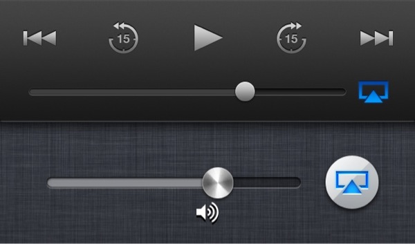
Apple updated the lock screen a couple of months ago; which aligned the cover art in the center of the screen for the iPhone 5, and changed the look of the controls. The first thing that I noticed was that the AirPlay icon when active changed from what has always been blue in color, to an orange.

When I got in my car this morning I loaded the Podcasts app and I noticed that there is yet another change in the AirPlay icon color. It has been changed back to blue, but it is a darker color than it was before. I know these are little details, but these are the little details that Apple usually sweats.