PixelLove - Icons for iOS Design

PixelLove is offering icons for use with your iOS designs. They have a Pro version and a lite version called the Infinity pack.

700+ iOS 8 tab bar icons & toolbar icons, retina ready with vectors & strokes for easy editing. Web fonts and free updates also included as part of the 'Infinity' pack.

In addition to the paid sets they have a royalty free set of icons available here.

These icons are great for use in Sketch 3.

Learn to Design

If you have ever wanted to learn how to design interfaces or even just how to use a vector based tool such as Bohemian Coding’s Sketch[1] then you should check out designcode.io.

Meng To is a self taught designer who has taken what he has taught himself and gathered that information into a website and ebooks that teach people how they can use Sketch to layout an interface and use Xcode to build an application from scratch.

There are currently three chapters:

  • iOS Design: walks the reader through different aspects of design such as how to chose colors, fonts, and sounds for an application; how and where to get your inspiration.
  • Learn the Tools: Focuses on learning how to use Sketch.
  • Build the App: Takes you through the process of using what you learned in the first two chapters and applying it to how to use Xcode to create an iOS application.

He is currently working on a fourth chapter that deals with Apple’s new programming language; Swift. The new chapter will be available to everyone who purchases a copy of the book.

Before he launched the book the price was $50.00 and he was expected to increase the price of the book to $100.00. Currently it is still $50.00 so if you are slightly interested in it you may want to jump on it while it is still discounted.

In addition to the book he aslo has a weekly newsletter that he distributes with various design resources that he has come across on the web.


  1. This application would be the equivilant of using Adobe Illustrator.  ↩

iCons!!!!

I wrote in a post on the eve of WWDC, that linked to a supposed mock up of the actual icons used in iOS 7, that hopefully the new icons do not look like the "mockups" that 9to5mac leaked. Prior to that post i had written a piece expressing my concerns about the rumors that I had heard about Apple's move towards a flat windows 8 like design.

Unfortunatley the 9to5mac leak turned out to be true, and I think that it was an actual leak. The author tried to pass it of that they had their graphics department mock the icons up in photoshop. I was hopeful that they had a new graphic designer who hadn't had much experience creating icons, coupled with the fact that this person was creating them based on how they were described to him, or her. However these horrible icons are a reality of the next operating system. I just don't understand how anyone could think that these icons are passable for Apple's standards, but there they are.

The rest of the operating system, for the most part looks amazing; save for the akward translucency in certain places. The OS certainly is not flat. It has a depth to it, and I can't wait to have a copy of it to see how it works in person.

For a comparison of what the icons use to look like and what they will look like in iOS7 I have linked to a picture from an article on mashable.com

iOS icons

I would have prefered that the icons looked like these that appleinsider.com had posted before WWDC.

iOS flat icons

Is iOS 7 Laying the Path Towards a Larger iPhone?

During the WWDC Keynote Monday, Apple pulled the curtain off of their redesign of iOS. I have my thoughts on certain aspects of the design, such as iconography, but will use this post to speculate on some observations I made while watching the iOS 7 demos.

The operating system has seen a radical change, and one of the most prominent aspects of the design is the use of layered sheets for things like Notification Center, Spotlight, Control Center, and the updated Share Sheets. Apple states that "Technology should never get in the way of humanity.", however while watching the videos I noticed that with these new overlays it almost seems that the current iPhone seems a little small for this new design.

My wife who loves to watch the keynotes with me actually said out loud, about the same time I had the thought, "It almost seems that the phone needs to be bigger now." I couldn't agree more; I think that Apple may be setting itself up to introduce another device size into the iOS world. Certainly this isn't the first post to proclaim that, but watching the Keynote and seeing iOS 7 in action I thought it looked like it was designed to be on a device that has more screen real estate to afford to it.

I love the size and weight of the iPhone 5, and have often wondered how cumbersome a wider phone might be. Even though I laugh at the oversized Samsung phones out there; I think I wouldn't mind seeing a bigger iPhone introduced this fall. I don't mind that is, as long as I don't see people walking around with iPad Mini sized devices strapped to the side of their faces talking on them.

Thoughts on Flat Design

I have been using Apple products for the last 15 years, and I personally have a preference in how well the operating system of Apple products stands out against all of it's competitors. When I first started using the Mac it was running the classic mac operating system, or Platinum rather. When I got my hands on a copy of the first version of OS X I was informed that I shouldn't install it on my main machine because it is a little buggy, but I went ahead and did it anyhow even though I had one computer; that being my main machine.

Ever since laying my eyes on the Aqua interface I haven't seen a better looking user interface come along. Granted Apple has changed the look of it through the years, certainly for the better, but it always gives me a feeling that I am using a superior interface. One look at any version of iOS and you can quickly associate it's features with Aqua.

There have been a lot of rumors since the departure of Scott Forstall, and the control of software design being handed over to Jony Ive that iOS is going to see a radical overhaul. I would assume that OS X would follow suit, if not in 10.9 but in version 11. I for one do not like what I am hearing about the design direction, and I have seen mockups, and supposed leaks of the actual icons. These "leaks" look as if Apple is stealing their designs from Microsoft Windows 8. Personally I hated the look of Windows 8 when I first saw the screens of the OS. Everything in these flat designs seem so uninspired and generic.

WWDC is less than 12 hours away so we all will know soon enough the direction that Ive has decided to take iOS. I can only hope that he has not tried to do so much of a dramatic change in the little time he has had being in charge of the interface design. I would rather that iOS 7 and iOS 6 look exactly the same if I can have an iCloud that works better than what we currently have.

Apple's Design Teams Need to Get on the Same Page

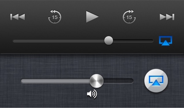
Apple updated it's Podcasts app yesterday, and before I hit update I wondered if there would be a redesign of the interface. I was correct in thinking that the skeuomorphic Reel To-Reel tape recorder was most likely removed. What I wasn't expecting was to have yet another instance of an inconsistent AirPlay design.

Apple updated the lock screen a couple of months ago; which aligned the cover art in the center of the screen for the iPhone 5, and changed the look of the controls. The first thing that I noticed was that the AirPlay icon when active changed from what has always been blue in color, to an orange.

iphone-20130322093523-0.jpg

When I got in my car this morning I loaded the Podcasts app and I noticed that there is yet another change in the AirPlay icon color. It has been changed back to blue, but it is a darker color than it was before. I know these are little details, but these are the little details that Apple usually sweats.

iphone-20130322093523-1.jpg