Finally using iTunes Match

Two nights ago I decided that it was time to give iTunes Match a chance. Since it’s debut my only hesitation to sign up; was the fact that there is a song limit of 25,000 songs. I am swiftly heading towards the 70,000 song mark I am over qualified for iTunes Match.

Besides the song limit, I wanted to at least wait and see what the initial reaction and what the limitations, if any to the service there were. Before Apple came out with the service I was already running essentially the same thing with the help of an app called AudioTap. AudioTap is a great little app; however it does not receive that much attention from it’s developer and has a limiting fact that your computer has to be running for you to be able to stream your library to yourself. After much deliberation[1], have decided to take a dive and test drive iTunes Match.

In order to get around the song limit of iTunes Match I created a new iTunes Library that resides in my Music folder named iTunes Match (I know; not very creative). For a little background; my regular library lives on my iMac but only contains the database file, and the artwork folder. All of the media that is associated with the database is loaded onto an external drive. In order to create an iTunes Match library I held down the option key while opening iTunes, which in turn brings up a dialog window that asks if you would like to create a new library or open an existing library. [2] After selecting create a new library and selecting the location for the library; the very next step that I took was to go into preferences under the advanced tab and make sure that copy songs into library was unchecked as this eliminates creating duplicate files.

From this point I go to the music folder located in my iTunes Music folder on my external drive and selectively click and drag the artists and albums that I want to be included in my Match Library. This way I can manage exactly what I want available to me on all of my devices. My main library has both my wife’s and my music, and there are definitely items that I do not want to come up in a shuffle that she owns.

The initial setting up iTunes Match was done with 2,472 songs. I was a little surprised that it took almost two whole days for the whole process to complete matching the songs, and uploading cover artwork for items that it didn’t have. I assumed that it would breeze through all of the tracks that were already available in the iTunes Store, but that really was not the case.

Before I add anymore songs to the library I have to run through and check out their iCloud Status and see what was matched vs. what was purchased. I am slightly confused, because there are items within the very same album that say they were matched and others say that they were uploaded. I need to determine why that is and see if there is a way that I can fix the tracks that say uploaded to have a matched status. I am using a couple of Smart Playlists [3]that Merlin Mann has created that give me a very quick way to analyze the status of the tracks in iTunes Match. I am going to use this playlist to try and figure out if I can alter the songs and get iTunes to recognize and match the songs that say uploaded.

My overall first impression is that I am pretty satisfied with iTunes Match. I don’t have to waste space on my phone to access my music, and I also don’t have to keep my home computer running to access the music like I do with AudioTap. After using it for a couple of weeks, and once I get a chance to tweak the unmatched songs I will have to sit down and write up any thoughts about how my opinion is after putting it through it’s paces.


  1. and a $25 iTunes gift card, making it free for the first year!  ↩

  2. For more on creating a seperate iTunes Library  ↩

  3. Merlin’s first Smart Playlist uses the Any condition. In this case it is if Any of the following are true. In order to get this option you must press the option key and the + button will turn into three dots (…). When you click the three dots you will have the option to pick Any.  ↩

Ryan Seacrest Invests in Typo

I don't understand why anyone would want this.

I had the (un)opportunity to type on a Blackberry for the first time back in September while on a buisness trip; as the owner was driving at the time. I wanted to throw the thing the window.

I will keep my opinions about the interface to myself, but trying to type with those tiny keys is infuriating to say the least.

iOS Screenshots Settings

The iPhone needs to have a dedicated camera roll for screenshots. I am always taking screenshots with my iPhone when I see an album in iTunes that I want to remember to download later, capture a section of an iMessage conversation, need a receipt of a purchase that I made, and countless other situations. These screenshots I want to have available for quick access later but they get buried amongst the million pictures that I take of my daughter[1], and are soon forgotten. Then when I want to import my camera roll into iPhoto I have to sort out these screenshots by not selecting them in the import window, and then processing them from the phone by deleting the ones I have already taken action on or saving them somewhere else to process later.

Admittedly this problem is probably not one that the average user has to deal with. Honestly I would bet that there are more people who don’t know that you can take a screenshot with your iPhone than people who know that you can. So all that I am asking is if in the Photos & Camera section in Settings that there be a toggle switch to send screenshots to a separate camera roll.[2]


  1. That seems almost like a literal figure at times.  ↩

  2. These need to be in their own camera roll, not their own album. Albums only reference pictures that live in the Camera Roll.  ↩

Metallica adds it's video library to iTunes

For those of you who like to take your video with you, we are excited to announce that six of our titles are now available on iTunes for digital download for the first time ever.  Visit iTunes to download Français Pour une Nuit (Live from Nimes, France), Orgullo, Pasión, y Gloria: Tres Noches en la Ciudad de México (Live from Mexico City), Cunning Stunts, S&M, Live Shit: Binge & Purge, and A Year and a Half in the Life of Metallica. Currently these titles are available in North America... keep your eyes peeled here for news about the rest of the world coming soon.

Nice to see this come to the iTunes store. I wish that some of the older recordings were released in HD though, but I will take what I can get.

iCons!!!!

I wrote in a post on the eve of WWDC, that linked to a supposed mock up of the actual icons used in iOS 7, that hopefully the new icons do not look like the "mockups" that 9to5mac leaked. Prior to that post i had written a piece expressing my concerns about the rumors that I had heard about Apple's move towards a flat windows 8 like design.

Unfortunatley the 9to5mac leak turned out to be true, and I think that it was an actual leak. The author tried to pass it of that they had their graphics department mock the icons up in photoshop. I was hopeful that they had a new graphic designer who hadn't had much experience creating icons, coupled with the fact that this person was creating them based on how they were described to him, or her. However these horrible icons are a reality of the next operating system. I just don't understand how anyone could think that these icons are passable for Apple's standards, but there they are.

The rest of the operating system, for the most part looks amazing; save for the akward translucency in certain places. The OS certainly is not flat. It has a depth to it, and I can't wait to have a copy of it to see how it works in person.

For a comparison of what the icons use to look like and what they will look like in iOS7 I have linked to a picture from an article on mashable.com

iOS icons

I would have prefered that the icons looked like these that appleinsider.com had posted before WWDC.

iOS flat icons

Is iOS 7 Laying the Path Towards a Larger iPhone?

During the WWDC Keynote Monday, Apple pulled the curtain off of their redesign of iOS. I have my thoughts on certain aspects of the design, such as iconography, but will use this post to speculate on some observations I made while watching the iOS 7 demos.

The operating system has seen a radical change, and one of the most prominent aspects of the design is the use of layered sheets for things like Notification Center, Spotlight, Control Center, and the updated Share Sheets. Apple states that "Technology should never get in the way of humanity.", however while watching the videos I noticed that with these new overlays it almost seems that the current iPhone seems a little small for this new design.

My wife who loves to watch the keynotes with me actually said out loud, about the same time I had the thought, "It almost seems that the phone needs to be bigger now." I couldn't agree more; I think that Apple may be setting itself up to introduce another device size into the iOS world. Certainly this isn't the first post to proclaim that, but watching the Keynote and seeing iOS 7 in action I thought it looked like it was designed to be on a device that has more screen real estate to afford to it.

I love the size and weight of the iPhone 5, and have often wondered how cumbersome a wider phone might be. Even though I laugh at the oversized Samsung phones out there; I think I wouldn't mind seeing a bigger iPhone introduced this fall. I don't mind that is, as long as I don't see people walking around with iPad Mini sized devices strapped to the side of their faces talking on them.

What iOS Looks Like (Hopefully Not)

After I posted my thoughts on flat design I checked a couple of my regular sites and saw that 9to5mac.com has a new post up called What iOS 7 looks like. They had someone in their graphics department mock up what the new icons look like. Say it isn't so...Here is an except from the post regarding the icons.

Yes, they are flat. Our in-house Photoshop guru Michael Steeber has mocked up (Above) the icons based on descriptions which closely match what I believe we’ll see tomorrow.

Thoughts on Flat Design

I have been using Apple products for the last 15 years, and I personally have a preference in how well the operating system of Apple products stands out against all of it's competitors. When I first started using the Mac it was running the classic mac operating system, or Platinum rather. When I got my hands on a copy of the first version of OS X I was informed that I shouldn't install it on my main machine because it is a little buggy, but I went ahead and did it anyhow even though I had one computer; that being my main machine.

Ever since laying my eyes on the Aqua interface I haven't seen a better looking user interface come along. Granted Apple has changed the look of it through the years, certainly for the better, but it always gives me a feeling that I am using a superior interface. One look at any version of iOS and you can quickly associate it's features with Aqua.

There have been a lot of rumors since the departure of Scott Forstall, and the control of software design being handed over to Jony Ive that iOS is going to see a radical overhaul. I would assume that OS X would follow suit, if not in 10.9 but in version 11. I for one do not like what I am hearing about the design direction, and I have seen mockups, and supposed leaks of the actual icons. These "leaks" look as if Apple is stealing their designs from Microsoft Windows 8. Personally I hated the look of Windows 8 when I first saw the screens of the OS. Everything in these flat designs seem so uninspired and generic.

WWDC is less than 12 hours away so we all will know soon enough the direction that Ive has decided to take iOS. I can only hope that he has not tried to do so much of a dramatic change in the little time he has had being in charge of the interface design. I would rather that iOS 7 and iOS 6 look exactly the same if I can have an iCloud that works better than what we currently have.

iOS Dictionary App?

dictionary.png

​iOS ships with a handful of generic utility apps such as Calculator, Stocks, Weather and Voices Memos to name a few. These are not the only apps that come pre-installed; but they usually fall under scrutiny from a number of posts recommending that you quickly tuck them in a folder, and replace them with any number of apps from the App Store. 

​One app that I realized that is not on iOS is a Dictionary app. You can select a word;  click Define and a style sheet displaying the definition appears. However there is not a full blown Dictionary app such as the one that ships with Mac OS X that you can search. Another feature of the OS X dictionary is that it has a built in Thesaurus. 

​I know that a dictionary app isn't going to change the world or anything, but it is interesting to me to see what Apple choses to add or not add to iOS. With that said I am trying real hard to not launch into a long drawn out post about the fact that the iPad doesn't ship with the Calculator, or Voice Memos apps.

iCloud storage relative to amount of devices

Every iCloud user is given 5GB of free storage, and that can be upgraded to 20GB of storage for $40.00 a year or to 50GB of storage for $100.00 a year. ​I currently have my account upgraded to the 20GB of storage, as I was pushing the limit of the free 5GB of storage that was given to me. 

Recently someone I know made the switch from the Microsoft world to a Mac. The transition slowly starting with an iPad, then an iPod touch, and then eventually he bought a Mac for home use. A conversation about iCloud came up between the two of us, and he was complaining about the amount of storage that Apple offers for free. He voiced his concern that he has these multiple devices and only 5GB of free iCloud space. His thought was that if he buys multiple devices then he should get an extra 5GB of storage on iCloud for no extra charge. My response was, you only get 5GB and that is just the way it is. If Apple gave away 5GB for every device then almost no one would pay to upgrade their iCloud, and Apple wouldn't make money off of the service. (I assume that Apple doesn't really make money off of iCloud as much as it probably turns whatever profit they receive from iCloud upgrades into maintaining the infrastructure.)

Since having the the discussion I have started giving it some thought and I have started to change my feelings towards the subject. ​I still feel that 5GB per device is an excessive amount for Apple to give away for free, and that it would never happen. However I do think that Apple could compensate multi device users with additional storage space to a point.

In my case I have two mobile devices, and two computers. OS X does not fully utilize iCloud for storage, but I would guess at WWDC this year it will be revealed that the Mac is getting more iCloud integration and therefore it will take up more of that storage footprint. I don't really now what a reasonable amount of storage would be for Apple to give out, but even another 5GB for free would be welcomed. The problem however with this whole philosophy is how does Apple determine how much space to give someone, and what happens if that person sells their device, should they be able to keep their upgraded storage since they have one less device?

If I look at my iCloud usage the only OS X apps that are using iCloud storage are Pages, Keynote, and Pixelmator. ​I had recently considered purchasing Together 3 which I would chosen to use iCloud to keep all of my stuff in sync between all of my devices. Something like that would use a significant amount of storage over time. If I go to my iCloud settings and look at my total storage used is, it is 8 GB, so I don't even need the full 25 GB that I currently have, but I need more than the 5GB that was given to me. 

Since developers have such a hard time trying to implement Core Data syncing I don't think that this is such an issue right now. This is because a lot of developers choose to provide access to Dropbox, or they build their own syncing services for their apps. The majority of an iCloud users storage is taken up by iOS backups, but if Apple finally gets Core Data right and developers start using iCloud more for their app data, then I think people are are going to start finding the need to require more iCloud storage for their devices. ​

Whenever Apple decides to make iCloud functional for developers to use the service to sync their app data I think that they are going to have to either give storage increases for people who buy multiple devices or offer a wider selection of upgrades for storage, such as more tiers than their current offerings.

DM-1 Drum Machine Released for Mac OS X

Fingerlab has released it's previously iOS only Drum Machine software for Mac OS X.

I have had the iPhone version for awhile and have only tinkered with it. Hoping to get into the OS X version and really learn how to create realistic drum tracks and then possibly that will lead to some advanced tinkering in the iOS version.

According to their description on the Mac Appstore 

DM1 for OSX is fully compatible with DM1 for iPad, you can share files between them.

Here is a list of the apps features:

DM1 is an advanced Drum Machine. It turns your computer into a fun and creative beat making machine. Easy and fast to use, loaded with 86 superb electronic drum kits and beautiful hyper-realistic graphics, DM1 has been designed for a lot of instant fun.


With Midi In & out, DM1 is ready to fit your digital audio workstation.

As electronic musicians ourselves, we, at Fingerlab, have developed DM1 with the intention of delivering the perfect mix between fun playability and powerful sonic capacities. We always keep in mind the importance of a beautiful design with the right balance of powerful abilities while avoiding clumsy, overbusy interfaces. 

Check our 86 electronic drum kits. 20 classic vintage drum kits plus 66 in-house produced electronic kits, edited and mastered at Fingerlab professional studio.

DM1 offers 5 main sections:

1 - THE STEP SEQUENCER Just turn on and off steps in your sequence to create cool beats, or unexpected rhythms!

2 - THE DRUM PADS simply lets you play and record the beat that tickles your fingers on the keyboard. No need to be a first-class drummer, automatic quantize does the work for you.

3 - THE MIXER for quick and subtle sound mixing of your drum kits. Featuring settings for volume, pitch, pan, sample length, custom drum kit element for each channel, mute and solo mode.

4 - THE FX TRACKPADS a creative duo of FX trackpads to distort, modulate and transform your beats. The effects include: Overdrive, Delay, Reverb, Phaser, Dalek, Formant, Resonant Filter & Compressor.

5 - THE SONG COMPOSER allows you to quickly make a song with the beat patterns you have created. Just drag and drop the patterns onto the timeline. Fast and easy.

DM1 for OSX is fully compatible with DM1 for iPad, you can share files between them.

Specifications:

• DM1 The Drum Machine for iPad winner Apple design Award 2012
• Fullscreen Retina Display 
• Smart ergonomy for fast creativity and fun 
• 86 vintage and produced drum kits, mastered at in-house Fingerlab Sound Studios
• import your samples and create your own kits
• Mixer with pitch, length and level rotary controls, pan controls, and custom drum kit per channel 
• Automation Panel for a precise and intuitive control of any Mixer parameter over time 
• Automation recording for FXs
• FX Trackpad for real-time sonic destruction and multi-FX 
• Time signatures
• The Randomizer tool
• Extra fast drum kit loading 
• Playable pattern selection for extra creativity 
• Mode song with intuitive editing 
• High-quality export 
• Full Midi Implementation 
• Import & Export your song project 


If Apple is boring then why are you writing about them?

​The title of Henry Blodget's article just kills me.

I find his claims that Apple needs to make an iPhone with a better battery, laughable. I have an iPhone 5 and out of the 3, 3G, and 4 it has the best battery life I have seen in an iPhone. Apple is the leader in developing better technology when it comes to batteries.

Moron.​

Wanted: Local iCloud Backups

The move towards the cloud is making it easier to get all of your data on all of your devices with little to no effort.

For the purpose of getting your contacts, calendars, bookmarks, reading lists, reminders, and notes on all of your devices, Apple's iCloud just works, as advertised. This has at least always just worked for me...so far.

I have completely switched my devices over to iCloud to let it manage this data, but I have been nervous ever since I turned it on. The fear is that I may wake up one day, open my contacts and there is nothing there. The same goes for all of the personal data I listed above.

All of these items could be manually backed up, but that would be time consuming and most likely something that you would easily forget to do.

It would be nice if Apple allowed users the ability to automatically download backups of these databases with the flip of a toggle switch. Having the ability to download a backup of this data, and allow it to save two or three revisions of that database would definitely make me feel more at ease with having my data in iCloud.

Even if Apple had been successful with all of it's attempts at online services, which everyone knows they have not, I would still be as leery with fully trusting that they would be able to protect this data forever.

For now I will just have to set reminders, and hopefully not be too busy to follow the process to manually back this data up so that I could restore it in the future if need be.

Apple's Design Teams Need to Get on the Same Page

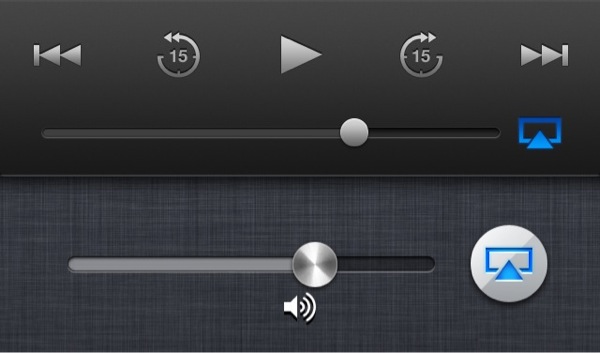
Apple updated it's Podcasts app yesterday, and before I hit update I wondered if there would be a redesign of the interface. I was correct in thinking that the skeuomorphic Reel To-Reel tape recorder was most likely removed. What I wasn't expecting was to have yet another instance of an inconsistent AirPlay design.

Apple updated the lock screen a couple of months ago; which aligned the cover art in the center of the screen for the iPhone 5, and changed the look of the controls. The first thing that I noticed was that the AirPlay icon when active changed from what has always been blue in color, to an orange.

iphone-20130322093523-0.jpg

When I got in my car this morning I loaded the Podcasts app and I noticed that there is yet another change in the AirPlay icon color. It has been changed back to blue, but it is a darker color than it was before. I know these are little details, but these are the little details that Apple usually sweats.

iphone-20130322093523-1.jpg